
What is a Brand Style Guide and why is it important?
Creating a Brand Style Guide
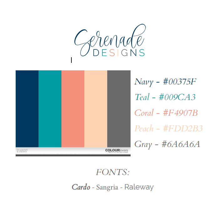
When focusing on graphics for your online marketing, I highly suggest creating a Brand Style Guide. When I create a Guide, I pulled together and organize the cohesive branding elements such as a business logo, color palette, and typography.
When developing this with my website design clients, we focus on logo, color palette, and fonts. Sometimes my clients come to me with logo files ready. Sometimes we start with the color palette first, and then we go from there. I just meet my clients where they are!
The end goal for a Brand Style Guide is to use these elements throughout your online presence — on your website, your blog, your social media, your videos, and your newsletter.
Why is a cohesive look important?
By creating a cohesive and consistent look across your online marketing, your audience begins to recognize your brand. By building brand awareness, you become the expert and the authority on music therapy in your audience’s mind. In turn, trust is gained with your brand and your business.
As trust is gained and grown, more clients will come in your door, more connections will be made with decision makers, and the general public will be educated about music therapy.
It takes approximately 5 to 7 impressions (aka interactions) for people to recognize your brand. That means repetition and consistency of your brand elements → your logo, your color palette, and your fonts/typography is essential.
EXTRA BONUS: You can actually save time by having a consistent visual look. Instead of taking up precious time looking for new fonts and experimenting with new color palettes every time you go to create a new visual for your marketing materials, you can quickly and easily pull your elements from your Brand Style Guide.
Julie
Creative Director, Serenade-Designs.com


Leave A Comment